You didn't notice it, but the design geeks on Reddit did.
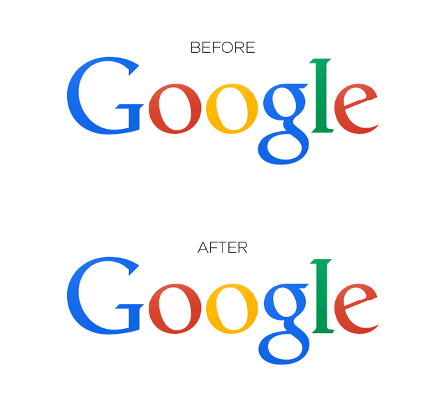
Google moved the "g" right one pixel and the "l" down and right one pixel, one eagle-eyed Redditor noticed on Sunday. Apparently, this was done to fix a very slight problem with the kerning of the letters. As another Redditor pointed out: "The bottom of the 'l' and 'e' did not line up horizontally and that, my friend, must have driven some design employee crazy."
Gizmodo wrote about the change yesterday, and got this statement from Google: "Great to see people notice and appreciate even single-pixel changes—we tweaked the logo a little while ago to make sure it looks its sharpest regardless of your screen resolution."
Compare the two versions of the logo below, also via Gizmodo:
