Quantcast
Channel: Adweek Feed
Viewing all 21596 articles
Browse latest View live

Colonel Sanders Channels Santa, Badly, in W+K's Silly Holiday Spots for KFC

$
0
0

You might call him the Southern Santa. 

In four new holiday videos from KFC, Colonel Sanders spends most of his screen time stuck in a home's chimney ... while trying to deliver presents. 

The Wieden + Kennedy spots continue comedian Norm McDonald's run of quirky ads as KFC's founder. That role has seen him host "Fryerside Chats" in pseudo-homage to FDR, do a bad impression of a college student and ride a giant chicken on a merry-go-round.

In the Christmas campaign's first ad, "Entrance," his inept beneficence finds him trapped in a fireplace with a tray of fried chicken (which, along with his arms, he was somehow able to squeeze past his firmly-lodged torso—quite the anatomical feat).


In another spot, he declares that his predicament—the same one from earlier—won't stop him from delivering his deep-fried treasures. 


The third commercial, an out-of-key rendition of "12 Days of Christmas" with the lyrics adapted to praise a value meal, doesn't add enough freshness to a tedious song to make it worth the effort—but at least it's mercifully short. 


The best of the bunch by far is "Gifts," in which a family gathered around the Christmas tree takes the weight off Sanders' shoulders—at least as far as keeping viewers entertained. All the presents, which might have looked like bicycles, dogs or puppies while wrapped, turn out to be KFC meals (surprise!).


That visual gag is plenty rewarding. But it's especially charming that the ad manages to poke fun at Christmas tropes while delivering a hard sell—forget the elaborate gifts, it suggests, just get some fast food and make everyone happier. That's an absurd premise delivered with enough forced cheer to make the pieces feel like a solid sendup: Dad, for his part, pulls faces that make him resemble a cross between Enzyte's infamous Smiling Bob and a gopher in an ugly Christmas sweater. All the while, the Colonel's feet dangle quietly in the backdrop.

As for the overall concept, the Santa-Sanders resemblance is close enough to pass muster at first blush—pudgy old white guys with white beards and white hair. But here's a weird-but-true fact: In Japan, the two are practically already synonymous: People there religiously eat KFC on Dec. 25, a tradition the company surely wouldn't mind porting to the U.S.

CREDITS
Client: KFC

Agency: Wieden + Kennedy, Portland, Ore.
Creative Directors: Eric Baldwin / Karl Lieberman
Copywriter: Jonathan Marshall
Art Director: Helen Rhodes
Producer: Hayley Goggin Avila
Social Strategy: John Dempsey
Strategic Planning: Britton Taylor / Matt Hisamoto
Media/Comms Planning: Alex Barwick / Anjali Patel
Account Team: Jess Monsey / Jesse Johnson / Andrie Wheeler
Business Affaires: Karen Roche
Project Management: Erin Keeley
Executive Creative Directors: Joe Staples / Mark Fitzloff
Head of Production: Ben Grylewicz

Production Company: Biscuit
Director: Matt Dillmore
Executive Producer: Colleen O'Donnell
Sales Representative: Dana Balkin
Line Producer: Carr Donald
Director of Photography: Darko Suvak

Editorial Company: Joint Editorial
Editor: Steve Sprinkle 
Asst. Editor: JB Jacobs
Post Producer: Chris Girard
Post Executive Producer: Leslie Carthy

VFX Company: Joint
VFX Executive Producer: Alex Thiesen
Lead Flame Artist: Stephan Lectez
VFX Producer: Steve Griffith
Lead Flame Artist: Katrina Salicrup
2D Artists: David Jahns / Robert Murdock / Noah Poole

Mix + Sound Company: Joint
Mixer / Sound Designer : Noah Woodburn
Producer: Sarah Fink

Telecine Company: The Mill
Colour Producer: Dan Kreeger / Dan Butler
Colorist: David "Luddy" Ludlam





Chinese Version of The Force Awakens Poster Noticeably Downplays the Only Black Actor

$
0
0

Sure, there are a lot of different ways to splice together a Star Wars poster, but minimizing the movie's only black star seems an odd choice.

Twitter user and producer Guy Lambert posted the following comparison after seeing Deadline's coverage of China's regional poster for Star Wars: The Force Awakens:

The main difference is, of course, the notable downgrade of the black character Finn, who's been a centerpiece of the movie's marketing since it began rolling out in 2014. (Chewbacca, it should be noted for intergalactic race relations, is missing entirely, as are some weird little alien and an X-Wing pilot I'm probably supposed to know by now.)

Since the first Star Wars trailer revealed 22-year-old British actor John Boyega in stormtrooper gear (and eventually wielding a lightsaber), his race has been a point of contention for some of the less diversity-minded Internet commenters. Boyega's response when these initial complaints about a "black stormtrooper" popped up late last year? "Get used to it."

It's possible that Disney's marketing team in China felt audiences wouldn't be able to get used to it and shrank down his presence on the poster, or it might just be an unintentional bit of visual prioritization. If the latter (we've reached out for comment), it was probably a pretty dumb one. Heck, maybe Chinese fans just really, really love TIE Fighters.

Here are the full official U.S. and Chinese posters:


The World Surf League's First-Ever Ad Likens the Volatile Sport of Surfing to Chaos Theory

$
0
0

To distill the unpredictability and drama of competitive surfing, the World Surf League has launched its first global campaign, "You Can't Script This," anchored by "Chaos Theory," a 90-second spot from ad agency Mistress. 

The mix of stock, custom and athlete footage includes surging seas, shifting sands and surfboard shaping—along with moody shots of billowing drapes, flickering video screens and a tornado funnel—accompanied by a breathless voiceover: "Isn't it something that a single breath has the power to spawn an entire storm a thousand miles away? We cannot predict it. We can only bear witness to the wonder." 

That last bit is so leaden, it nearly sinks the whole enterprise. Yet the use of such hyper-saturated prose makes sense when you consider the level of passion and reverence serious surfers have for the sport. 


"We're focusing our 2015 media spend where our target audiences consume the sport—digital and social. As we continue to expand our message and recruit new fans into competitive surfing in 2016, we will rely more heavily on traditional channels," WSL chief marketing officer Scott Hargrove tells AdFreak. "The goal is to establish an authentic connection with existing surf fans and then carefully expand our message to new fans beyond surfing's core." 

To achieve that end, the commercial—breaking today, ahead of this month's Billabong Pipe Masters competition in Hawaii—could have used a tighter focus. For example, 72andSunny's epic ads for Samsung explored the spiritual interconnectedness of the surfing community and put a human face on the sport, while capturing the intensity of training and competing in snarling wind and swirling waves. 

"Competitive surfing is constantly changing and evolving—from upsets to perfection, a thwarted shark attack to the most hotly contested championship race in years," Hargrove says. "We believe this unpredictability is what makes the sport so compelling and therefore made it the focus of our creative strategy." 

Fair enough. And while not a total wipeout, it's a shame "Chaos Theory" relies so heavily on clichéd "dramatic" imagery and language. The underlying metaphor rocks, but despite its quest to portray surfing as a constant surprise, the ad feels a tad predictable. 

CREDITS

Production Company: Eskimo
Executive Producer: David Martinez
Director: Dan DiFelice
Director of Photography: Khalid Mohtaseb
Producer: James Parker
Postproduction: Eskimo
Post Producer: Tamar Sasson
Editor: Scott Hanson
Assistant Editor: Scott Crozier
Designer, Motion Designer: Jerry Liu
Visual Effects: Blacksmith NY
Sound Design: Cypher Audio

Agency: Mistress
Creative Director, Partner: Scott Harris
Strategy, Partner: Christian Jacobsen
Art Director: Megan Nakazawa
Copywriter: Adam Wagner
Brand Director: Victoria Edwards
Brand Manager: Kylie Wu
Agency Producer: Trevor Paperny
Project Manager: Alex Clewell


How This Agency Used Ad Blockers to Recruit the Kind of Creatives It Wanted to Hire

$
0
0

Generally speaking, a challenge that disrupts your business model is a chance to invent whole new ones. The Internet—and all the disruption-enabling goodies it's brought with it, like ad blocking—has proven no different ... though many brands and publishers are still trying to sort their Rubik's Cubes out. 

But sometimes a different perspective is sufficient to bring you closer to solving the problem than others. In the case study below, Belgian ad agency Boondoggle explains how it used adblockers to recruit new employees. 

"Everyone hates online ads. Except for advertisers and publishers. They hate adblockers," the video begins. But even then, "10% of advertising people use adblockers themselves."

Can we see a show of hands? Just kidding. We know you all use them.


For its most recent recruitment push, the agency created a special banner equipped with an ad-blocker-detecting plugin. (An ad-blocker-detecting plugin? you say. Yeah, these guys don't fool around. See how their video is all text? That's because it was made for a Facebook audience, where videos autoplay without sound. It's already gotten nearly 6,000 views, which isn't small potatoes for a Belgian brand.) 

Then they bought space on all major Belgian advertising news sites. 

The banner read, "You block ads, even if you work in advertising? Then maybe you're the person we're looking for. Join us and let's create campaigns that are really useful to people." Users were then sent to a list of Boondoggle job opportunities. 

Everybody's freaked out about AdBlock. Last month, winning the award for Most Alienating Service Brand of the Day, Yahoo! admitted it is testing ways to block AdBlock users from certain services, including locking them out of their own inboxes (a great way to remind people that we own nothing in the free economy, by the way). But in addition to all the efforts AdBlock is making to calm the industry down—like offering adblock-related analytics and doing retargeting business with Criteo—there's a lot of good writing out there that explains why people (including ad people) use them in the first place.

Most ads are annoying, ugly and suck. They pop up. They block content. They chase people around, and use data that we didn't sell them to retarget us. 

Ad people who recognize this problem, and behave like users do, have the chance to make this better. They're best positioned to create work that innovates past blocking technology—and, more importantly, create ads they actually like. (Because if ad-blocking ad people like them, we're fairly optimistic regular people will, too. The operative word is fairly—but they do have a better shot at this than pious ad folk who deny the problem exists.) 

At the close of its video, Boondoggle says it's looking for "ad people who don't believe in bombing people with ads," people who'd rather find brand and design solutions that innovate around those challenges. It cheekily ends, "Thank you, adblockers."

Thank you, Boondoggle. If more agencies and brands thought like you do, maybe South Park would hate us less.


What Can You Learn From 2015's Most Viral Billboard?

$
0
0

If you know what this billboard means just by looking at it, you're cool. If you don't, you're probably in need of some schooling. Maybe, at the end of the lesson, you'll buy a billboard of your own. That's what Clear Channel Canada hopes, anyway. 

Last month, alongside Universal Music Canada, rapper (and grandpa dancer) Drake erected an enigmatic 30-by-60-foot posting that read, "The 6 God is Watching," alongside a highway in Toronto, his hometown. 

In Clear Channel's telling, passersby noticed the billboard and posted photos to Twitter and Instagram, where speculation about its meaning snowballed into news coverage, none of which was helped by an equally cryptic post on Instagram from Drake himself. 

For anyone not steeped in the rapper's lore, the phrase "6 God" and its accompanying iconography are symbols for Drake's brand, recognized by fans. The "6" is his nickname for Toronto, derived from its area codes (416 and 647). And for all the other olds out there, the praying hands reference the prayer hands emoji (though these were apparently derived from a 16th century German painter's work), representing, in this instance, "God"—a humble allusion to Drake himself. 

In plain English, Drake—whose human name is Aubrey Graham—is branding himself the deity of the Toronto rap scene, a message that's captured in his song "6 God" from his recent mixtape, If You're Reading This It's Too Late. (For a particularly thrilling spinoff, watch Salman Rushdie read part of it for you.) 

Put in that context, and playing on the word "Watching," the billboard is a sly promotion for Drake's upcoming album, Views From the 6. Clear Channel, which sold the placement—and is eager to peddle more—describes it as "the most viral billboard in history." 

The company claims earned media impressions totaled a whopping 86 million, not counting broadcast coverage. Online outlets that featured the billboard included MTV, Time, GQ, Pitchfork and Complex. 

Clear Channel's more in-depth postgame is worth skimming (taking, with a grain of salt, the "learnings" for a broader class of advertisers, though there may be some). 

"This billboard looks like it could have been designed by a panda bear on a 1993 IBM Thinkpad, but that didn't matter," says Mark Young, chief marketing officer of social media monitoring firm Sysomos, in a choice excerpt of his analysis for Clear Channel. "In fact that may have been the point. This campaign's simple, mysterious nature compelled people to speculate, share and discuss. A killer creative idea still trumps all." 

Sure, it was smart to make fans feel in-the-loop while leaving everyone else scratching their heads. But the truth is, Drake was just hyping his own hype: He has yet to set a release date for his album, and the sign, for all the buzz it inspired, didn't reveal anything new. 

But setting aside his 16.6 million Instagram followers, and the fact that he's one of 2015's biggest celebrities, the real reason it worked is that people care deeply about music and are willing to invest in learning more about musicians they love—if only so they don't feel stupid when everyone else at the party is talking about it. 

Most marketers don't have that luxury. Perhaps more important, most marketers lack the bravado required to publicly, if subtly, refer to themselves as gods ... even if they might feel that way sometimes. 


Coca-Cola's Ingenious Holiday Bottle Has a Label You Pull Into a Festive Bow

$
0
0

Can a classic drink be a gift in itself?

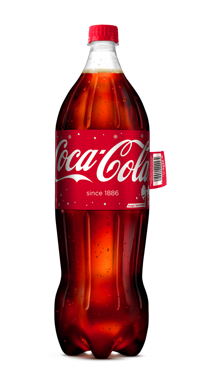
Coca-Cola's new Christmas campaign in the U.K. includes "bow bottles"—1.75-liter containers with a label that transforms into a bow. And while lots of brands roll out special packaging for the holidays—grocery store aisles are peppered in red and green this time of the year—the bow is a unique attention grabber.

A YouTube user demonstrates below:


Coke—whose innovative packaging ideas, from names on the bottles to incredible caps, are legendary—released the new bottles at the same time as its Coca-Cola Christmas truck tour, which is traveling the U.K. to celebrate Coke's "Holidays Are Coming" TV ad, running for 20 years now.

The delightfully festive bottles are available for Coca-Cola, Coca-Cola Life, Coca-Cola Zero and Diet Coke. Sadly, you can only get them in the U.K., so excuse us while we resign ourselves to drinking plain, unadorned Diet Coke like peasants.

See more fancy bottle action below.


Krispy Kreme Rigs a Glazing Machine to Create a Scannable Barcode for Free Donuts

$
0
0

Here's an oven-fresh, charmingly simple sales promotion from Krispy Kreme.

For its #dayofthedozens program, the doughnut chain and agency Baldwin& rigged a glazing machine to diffuse streams of sugary white goo in a distinct pattern against a black backdrop—forming a barcode image—before coating the fried treats on the conveyor belt below.

On Dec. 12, 2015, consumers can use this YouTube video as a scannable coupon for a second dozen donuts free when they purchase a first dozen at Krispy Kreme: 


Setting aside the fact that nobody should have access to 12 Krispy Kremes in one sitting, let alone two dozen, the idea nicely amplifies the production hardware that famously graces the brand's locations. 

At three minutes long, the video is also hypnotizing—not a bad way to get consumers to stare at the product, even while sober. 


CREDITS
Client: Krispy Kreme

Agency: Baldwin&, Raleigh, N.C.
Creative Directors: David Baldwin, Bob Ranew
Art Director: Jimmie Blount
Copywriter: Britton Upchurch
Producer: Liz Stovall
Media Director: David Dykes
Digital Media Strategist: Holly Sigler

Production, Postproduction Company: Remedy, Raleigh
Director, Director of Photography: Josh Sliffe
Assistant Director, Producer: Austin Simmons
Assistant Director: Ali Petre
Gaffer, Grip: Terry O'Deen
Makeup, Wardrobe: Elaine Harrison (behind-the-scenes videos only)
Production Assistant: Matt Carter


Santa's Computer Catches the Bah-Humbug Virus in These Witty Ads From Norton

$
0
0

So far, Santa is having an exasperating holiday season.

A few weeks back, he got physically assaulted in a Coach commercial. Now Kringle's computer has been hacked, and his "Naughty Or Nice" list held for ransom, in a droll series of ads by Grey San Francisco for Symantec's Norton security brand. 

In the spot below, Santa calls the cops when he discovers the "bah-humbug" virus infecting his laptop and the list missing. Alas, the responding officer can't put things right ... and even seems to harbor a grudge against the Big Elf: 


Next, Santa's son Kris Jr.—who looks like a cross between John Cleese and an extra on Portlandia—tries, and fails, to retrieve the lost list. When Santa bemoans a world in which an apparently safe site can serve as a front for hackers, Junior taps his dad's PC and explains, "In here, people aren't who they seem to be. It's like those guys who dress up like you at the mall."


These first two episodes have been available online for about a week. In the final chapter, which dropped today, Santa turns vindictive, vowing to fill the world's stockings with coal.

"We may not have enough," wails a put-upon elf.

Santa barks back, "Well, send someone up the flue to jiggle the thingy! Remember, it gets stuck!" Can anything save Christmas—like Norton, for instance? (And where's Edward Snowden when you need him? His name's kind of Christmassy, and he knows all about hacking ... though whether he's naughty or nice depends on your point of view.) 


"We chose to focus on Santa, a friend to the world, to reinforce that anyone can get hacked," Kathryn Kane, Norton's senior director of global brand and campaigns, tells AdFreak. "Online crime typically increases during the holiday season. More and more personal information is being stored online due to holiday shopping, so it is important that consumers understand why they should protect their devices." 

The 60-second videos are running on sites like Mashable, Gizmodo and Lifehacker, supported by native articles, infographics and social content. Of course, edgy Christmas ad concepts and Ashley Madison data-hack humor are nothing new. But the writing here is especially sharp, and the cast perform their bitchy schtick to perfection. 

"Santa's reaction, while grouchy, actually isn't too much different than consumers'," says Kane, noting that, in Norton's Cybersecurity Insights Report from November, "two-thirds of online crime victims felt frustrated after the incident occurred—while nearly half were furious."

Made for less than $600,000, the festive yet low-budget production has considerable charm. "We shot the films all in one day at Rubel Castle in Southern California," says Kane, "and had endless conversations around how much facial hair Kris Jr. should have. After all, he is Santa in training."


Allstate Vows to Protect Your Firsts in This Lovely Ad About a Gay Couple's First Child

$
0
0

A gay couple and their daughter are the centerpiece of this family-focused ad for Allstate. After the pair explain their year of firsts—including their marriage, and the adoption that followed—Allstate pledges to "protect your firsts, and every moment in between." 

The tone is refreshingly casual in its treatment of the couple's sexuality, which feels tertiary compared to the unique and universally relatable joys of first-time parenting, and the importance of family. It's a pleasant signal of things to come; as gay couples grow more commonplace, their media depictions will also become more genuine. 


Feel-good progressivism aside, the ad—by T3 in Austin, Texas—is well put together. And while Allstate probably should have integrated its brand a bit more obviously, we're glad they didn't. This is one of the few cases where the "Oh, by the way, this is a commercial" approach works well.


This Touching Costa Rican Ad Reminds Us Great Gifts Don't Have to Cost a Fortune

$
0
0

For Gollo, the biggest retail chain in Costa Rica, McCann gives us "Frozen," a charming little spot that depicts how a small gift can last a lifetime ... or even two. 

The ad follows a young boy, skipping along on a hobby horse in a rural landscape, who receives a gift from his grandmother. As he contemplates it, we glide forward in time: Our boy ages, still clutching the object, and the world changes around him. 

The circle completes itself in the modern day, where he is now the grandparent, passing the gift to a new little boy (who would probably have preferred an iPad, but this is an ideal world where children recognize the symbolic importance of things they've been given). 

"The best gifts last for a lifetime. Make sure you give the best one," the spot concludes, a gentle reminder that the act of giving is only half of a gift; its thoughtful selection is what infuses the gesture with meaning. If the concept feels a little dated, that's probably because we're awash in retail ads that focus on the louder aspects of the holidays: glitzy parties, the stress of hosting or the competitive sport that shopping has become. 


Then there's the matter of gifts themselves. British retailer Harvey Nichols has stoked the flames of our worst impulses for years, and this season is no different: This year's hashtag-ready campaign, #GiftFace, teaches Brits how to fake it when they're submerged in presents that suck. 

That alone should give us pause. Maybe we've become too blasé for small, "It's the thought that counts" kinds of gifts. But it's charming for a retailer to remind us we don't have to spend a fortune to show we care. 

A tiny plastic horse is way less expensive than an iPad, say, or a gold watch—though if we're competing on story, that gold watch from Pulp Fiction still beats it. (Sadly, few can claim the unique triumph of passing along an item that's been carried up Christopher Walken's anus in wartime. But every family has their thing.) 

CREDITS
Agency: McCann San José, Costa Rica
Chief Creative Officer: Brian Maynard
Creative Director: Huele Escalante
Art Director: Edgar Mora
Account Director: Mario Gutiérrez
Executive Producer: Lucía Salas
Production Company: La Productora
Director: Neto Villalobos
Photographer: Nicolás Wong
Executive Producer: Christian Bulgarelli / Carolina Barquero
Producer: Jéssica Valerio
Art Director: Daniel Montiel / Katia Umaña
Art & Costume Artist: Katia Umaña / Diego Esquivel


Roadkill Raps in This Insane Road-Safety PSA That's Selling Something Else, Too

$
0
0

What do wiper blades have to do with the safety of your state's wild animals? Why does the Humane Society care about windshields in the first place? And how does a throwback music video powered by synth riffs and retro raps fit into the equation? 

Turns out the Humane Society and Bosch North America share an interest in saving would-be roadkill and their glorious nuts/stink glands from drivers whose windshields aren't clear enough to see the road on dark, rainy nights.

Grey New York (part of Adweek's 2015 Global Agency of the Year network) recently collaborated with the auto parts manufacturer and the animal rights group to get to the heart—or at least, the anus—of the matter with a digital campaign and website called "Stop the Roadkill."


Rick Cusato, partner at Grey New York, tells AdFreak that the agency has worked with Bosch on various campaigns for several years, but "the category is low interest, and we wanted to think of a way to help people remember the importance of road safety." 

They certainly got us to pay attention. 

Oddly, the spot reminds us mostly of '80s music videos: It's like a cuddlier mashup of "Thriller" and the puppet-centric "Land of Confusion" by Genesis, which always scared the hell out of us as kids. (Have you forgotten creepy puppet Ronald Reagan? Didn't think so.)

The song wouldn't even sound out of place on your agency's 1986-themed holiday party mixtape. Catchy, wasn't it? 

Cusato says Grey brought the Humane Society into the conversation after coming up with the music video PSA idea due to "a mutual end benefit," adding, "When we presented, they loved it."

The challenge here is that most drivers never think to change their wiper blades. By worming its way into their heads, the video's "Don't Be a Killer Car" hook might just inspire more car owners to think about getting new blades to protect both their families and whatever aspiring four-legged rappers might be waiting beside the road. 

The campaign site also includes a bit of biographical information about each of the video's stars. Turns out Streetz the Skunk refused to leave the dangerous Foothill Lane area in order to solidify his cred while full-time student Francesca the Fox is looking for a "silver" gentleman who's too experienced to get caught in the headlights. 

"These were actual puppets run by puppeteers, and each had its own choreographer," says Cusato. Grey collaborated with New York-based production company Hornet to bring the puppets to life, and Grey's team wrote the song and its genitally focused lyrics. "Every time we tested it, people said they couldn't get it out of their heads," Cusato says. 

Regarding Bosch, Cusato tells AdFreak: "They're a very brave client. Lots would balk at this project." He adds, "Roadkill is a global issue, but nobody ever really talks about it."

Maybe now is the time for that discussion to start.

Beyond the puppets, Bosch recently renewed its partnership with meteorologist Jim Cantore of The Weather Channel. An ad starring Cantore will run alongside the PSA, though it will include 100 percent fewer references to assholes and testicles.

CREDITS
Client: Bosch
Agency: Grey New York
Global Chief Creative Officer: Tor Myrhen
Chief Creative Officer: Andreas Dahlqvist
Executive Creative Director: Ari Halper / Stephen Krauss
Creative Director: Joao Coutinho / Marco Pupo
Art Director: Andrew Barrett / Anthony Coleman
Copywriter: Pieter Melief
SVP Associate Director Of Film Production: James McPherson
Agency Producer: Sophia Pellicoro / Zach Fleming
Agency Music Producer: David Steinberg
Account Team: Rick Cusato / Danielle Fields
Audio Engineer: Dante Desole/ Ryan Hobler
Production Company: Hornet, New York
Director: Peter Zluszka
Director of Photography: Zak Mulligan
Production Company Executive Producer: Hana Shimizu
Production Company Producer: Marty Geren
Editor: Anita Chao at Hornet


Do These 'Instagram Husbands' Remind You of Any Poor Bastards in Your Life?

$
0
0

The life of an Instagram star might seem stylish and elegant, but what about the poor sidekick left holding the camera like some off-screen putz?

A new video called "Instagram Husband" tells the heartbreaking (or at least relatable) story of men whose existence has dwindled into two roles: taking photos and waiting patiently to take photos.

And yes, they really did book InstagramHusband.com, which is basically a Tumblr of related memes.

The video comes from The Mystery Hour, a Springfield, Missouri-based comedy show that airs on two Fox affiliates. The clip is an impressive bit of social satire, especially coming from such a relatively obscure source. 

Check out more of the show's videos on YouTube.

For the record, my wife says I'm totally the wife in this video, though I never make her take the pics. I'll squat over my own pickle jars on the back patio with iPhone in one hand and paper lantern in the other, thank you very much.

Hat tip to my friend Kelly Whalen for sharing this one on Facebook.


That Uncomfortable Brother-Sister Ad for Folgers Gets Even Creepier in Parody Extended Version

$
0
0

When Folgers created its 2009 ad about a brother and sister's touching reunion, the brand certainly didn't mean for it to become an anthem for incest.

But something about the meaningful looks exchanged between the siblings and their oddly uncomfortable repartee has caused it to be remembered as "the Folgers incest commercial."

Now the comedy troupe at Above Average has created an "extended version" of the spot, and you can probably guess where things head next. Unless you think it's about to become a porn, in which case thankfully it doesn't go there. Well, not quite.

Check it out below:

Here's the undoctored original:


This Automaker Turned Its Owner's Manual Into a Beautiful Work of Prose, Poetry and Art

$
0
0

If your car manual were an entertaining work of fiction filled with pretty illustrations, you might be more inclined to read it.

That, at least, is the hope behind a new marketing stunt from Romanian auto brand Dacia. This November, the company celebrated its 10th year sponsoring the Gaudeamus book fair by commissioning 30 writers and artists to transform its driver's manual into a work of prose and poetry.


The resulting publication turns dry—if important—chapters like "Tools," "Dashboard," "Child's Security" and "Safety Belt" into pieces that traverse genres from science fiction to romance, with every story illustrated accordingly.

Publicis Bucharest is billing the book as literature, which might be a stretch for any utilitarian product like this. But it's a fun and clever idea, and the illustrations look great. 


If you're concerned about useful details getting lost in translating a technical document into art, don't worry: While the brand is looking to distribute the "Alternative Manual" in showrooms, it plans to do so alongside—not instead of—the standard manual. (Which means you now have two things to read instead of one.)


Can't Decide What to Netflix Next? This Ad Has a Few (Dozen) Helpful Suggestions

$
0
0

Bingeing on your favorite TV shows and movies can be a blast, but the existential emptiness that follows after finishing a season—or a whole series—can be sheer hell.

Need help? Netflix has the solution: Pick something new to watch.

But which title would be just right? you ask. "The List," a 90-second spot from TBWA\Chiat\Day, explores this particular strand of first-world angst with a self-consciously kooky pair who need a fresh TV show or movie to stream. 

Will it be Bloodline? Peaky Blinders? Narcos? Sense8? Jim Gaffigan: Mr. Universe? Joan Rivers: A Piece of Work? How to Get Away With Murder? Nikita? The Carrie Diaries? Murder She Wrote? Heathers? Ferris Bueller's Day Off? Saved By the Bell? Glee?


The dude in the commercial trots out a seemingly endless string of possibilities as he and his gal pal—they're "best friends"—do yoga, play cards, bounce on a trampoline, climb trees, sunbathe, take a cooking class and go clubbing, among other activities. (When do they even have time to watch the tube? Does anyone still call it the tube?) 

Meanwhile, our heroine despondently mulls the options, distracting us with her distant resemblance to Alyson Hannigan of Buffy the Vampire Slayer and How I Met Your Mother—neither of which appear on the list, in case you wondered. 

Clay Weiner's wry, breathless direction drives home the silly spot's punch line, which we didn't see coming. Then again, we aren't nearly as sharp as we used to be, probably because binge-watching so much TV has muddled our brains. 

Anywho, bottom line: This video won't help you pick a new show. It serves more to magnify a common problem, then flagrantly showboats the scope of Netflix's selection. But if you've just finished a binge and don't know what to watch next, you can always take up this fun and useful DIY project while trying to decide. 

CREDITS
Client: Netflix
Agency: TBWA\Chiat\Day
Fabio Costa: Executive Creative Director
Matthew Woodhams-Roberts, Dave Horton: Creative Directors
Peter Bassett: Director of Production
Kristin McCarron: Producer
Peter Ravailhe: Managing Director
Tyra Hillsten: Brand Leader
Sarah Lamberson: Brand Director
Desiree Perez: Brand Manager
Rohit Thawani: Director of Digital and Social Strategy
Gary Klugman: Planning Director
Emilie Arrive: Senior Digital Strategist
Lauren Maddox: Digital Strategist
Mimi Hirsch: Senior Business Affairs Manager

Production Company: Biscuit
Clay Weiner: Director
Shawn Lacy: Managing Director
Holly Vega: Executive Producer
Lisa Stockdale: Producer
Editorial: Rock Paper Scissors
Christjan Jordan: Editor
Pieter Viljoen: Assistant Editor
Carr Schilling: Executive Producer
Remy Foxx: Producer
Visual Effects: Framestore
Dez (Derek) Macleod Veilleux: Executive Producer
Ben West: Creative Director, Visual Effects Supervisor
Andy McLintock: Senior Producer
J.D. Yepes: 2-D Lead
Mike Bain: 3-D Lead
Scott Boyajan: Commercials Producer
Telecine: Company 3
Dave Hussey: Senior Colorist
Sound Design: Stimmung
Gus Koven: Sound Design
Kristina Iwankiw: Producer
Ceinwyn Clark: Executive Producer
Mix: Eleven
Jeff Payne: Mixer
AJ Murillo: Assistant Mixer
Dawn Redmann: Producer
Suzanne Hollingshead: Executive Producer


Newly Single? ManServants Is the Perfect (and Real) Antidote to Heartbreak and Netflix

$
0
0

So, you just dumped your boyfriend. Now it's time to kick your baggage, along with all the residual crap he left behind, to the curb. Where to turn? 

ManServants, a San Francisco-based startup, has the solution: Say hello to Heartbreak ManServant, a gorgeous, well-mannered, impeccably groomed guy who is not—we repeat, not—a gigolo. He's so much more useful than that! He'll help you delete the ex from social networks, burn his photos and prop you up with pep talks, sparkling smiles and mixed drinks. Other variants of ManServant will even do your housework

The promotional video below, by director Jenn Khoe, is your best introduction to the cheeky ManServants formula, whose spirit lands somewhere between an SNL skit and a wink: 


The hunky men at ManServants are trained to pamper, flatter and cater to the woman or man who orders them. For the Princess Bride fans out there, "As you wish" is one of their most-repeated phrases: He's the handsome alternative to your ugly cry, say the company's founders, former advertising copywriters Dalal Khajah and Josephine Wai Lin. 

ManServants debuted in fall 2014 as a PG-rated alternative to male strippers. It offers butler-bodyguard-cabana boy mashup services for special events like bachelorette and dinner parties, among other occasions. 

Because lots of romances end in the last few months of the year, ManServants launched a "holiday collection" aimed at taking the sting out of being newly single. Options in this special collection include Arm Candy ManServant, who'll brighten your dreary obligatory gatherings; and Domestic ManServant, who'll tidy up while telling you how fabulous you look before the big soirée. 

But you can't keep them; they're rentals. In fact, they're best when gifted from one friend to another ... because your best pal can't stand to see you under the covers, eating carbs and bingeing on Netflix any longer. 

So, what are you waiting for? Set that three-fourths-empty wine bottle down. If you're moping around in New York, Los Angeles, San Francisco or the Gansevoort Hotel NYC (which is oddly specific ... and probably won't help dampen the inevitable "escort" jokes), a whole array of ManServants is waiting to do your bidding. 


All Is Not Merry and Bright in the Season's Most Shocking Retail Holiday Window

$
0
0

Retailers pull out all the stops for the holidays, which makes it a great time for window shopping: There's nothing like an enchanted display to make you feel delightfully childlike with your grownup dollars. 

This window in Toronto, though, might give you pause for reasons less merry. 

FCB Toronto conceived "The Window Project," which, from Dec. 6-13, appears in the window of the Untitled & Co. store in Toronto's Fashion District. The project was made for the Ontario Association of Interval & Transition Houses (OAITH), in partnership with the Yellow Brick House. 

From a distance, the display looks like a garden-variety holiday window—a family at table in Christmas sweaters, surrounded by cheerful decorations. If you're extra observant, you'll see that none of the mannequins are smiling, which probably wouldn't strike you as such a big deal; they're mannequins, after all. 

But keep watching. Moments in, the man's hand flips upward in a disturbingly recognizable gesture; the woman's upper body reflexively pulls back.


"The holidays can be a confusing time for women in abusive relationships, especially when there are children involved," says Charlene Catchpole, chair of the OAITH board of directors, adding that many "put on a good face and project an image of stability to keep the holidays a happy time. Our hope is that this campaign will break the lingering culture of silence that exists around violence against women." 

In a 2013 study of family violence in Canada, nearly eight in 10 victims of intimate partner violence were shown to be female. Levels of domestic abuse and suicide spike dramatically over the holiday season, the video claims (though the Annenberg Public Policy Center has debunked this for suicide and even finds the opposite to be true, at least in the U.S.). Per Yellow Brick House, transitional shelters see a 30 percent average rise in support calls. 

But while the window may startle you, FCB also meant for it to be empowering: Window shoppers can stop the abuse, halting the display for 60 seconds at a time, by texting a donation of $5 to OAITH. This money will fund support for women and families impacted in Canada. 


"This effort gives every person the opportunity to personally witness the power one donation can make," FCB Toronto chief creative officer Jon Flannery says. It was also a motivator for Untitled & Co—co-owner and design director Chloe Sam-Mcgrath says the immediacy of impacting change was critical. 

"If one woman is helped by this effort, it worked," Sam-Mcgrath says.

The Dec. 6 launch date also coincided with the National Day of Remembrance and Action on Violence against Women in Canada, established in 1991 to mark the anniversary of the murders of 14 young women at the École Polytechnique in Montréal, dubbed the Montreal Massacre of 1989. 

The case of the Montreal Massacre might be more familiar to Canada's southern neighbors than any of us would like, if only because it speaks what is now a fairly regular occurence: A young man entered a university, wandered from room to room dividing his victims by sex, and shot 24 women and four men, killing 14 women—his primary target. The led to more stringent gun controls and changes in how police tactically respond to such events, in addition to the day of remembrance.

Fourteen roses in the window represent each victim.


CREDITS

Project: The Window Project
Creative Agency: FCB Toronto
CEO: Tyler Turnbull
Chief Creative Officer: Jon Flannery
VP Creative Director: Jeff Hilts
VP Creative Director: Nancy Crimi-Lamanna
Art Director: Jeff Hilts
Writer: Nancy Crimi-Lamanna
Art Director: Naeem Walji
Group Account Director: Anabella Mandel
Project Manager: Lindsay Hann
VP, Digital: Corey Messom
Head, Broadcast Production: Tony De Sousa
Producer: Rea Kelly
DOP: Jorge Vasconez
Location Scout: John Dranski
VP Director of Strategic Planning: Heather Segal
Digital Strategist: Emma Cunningham
Account Planner: Spencer MacEachern
VP Corporate Communications Manager: Stephanie Sipe

Editorial: School Editing
Partner, Executive Producer: Sarah Brooks
Editor: Lauren Horn
Executive Producer: Emily Torontow
Assistant Editor: David Larocque

Globacore Interactive Technologies
Co-Founder/President: Ben Unsworth
Lead Business Development: Mike Phillips
Ontario Association of Interval & Transition Houses
Marlene Ham- Provincial Coordinator
Charlene Catchpole- Chair, Board of Directors

Yellow Brick House
Lorris Herenda- Executive Director

Blue Square
David McGuire- Principal

Globalcore Interactive Technologies
Ben Unsworth- President
Mike Phillips ­ Business Development

Store Front
UNTITLED & CO
Cameron Wilson - Creative Director/ Co-Owner
Chloe Sam-Mcgrath - Design Director/ Co-Owner


Porsche Punks New Drivers by Making Them Take Their Test in a 911 Carrera 4

$
0
0

There's a reason your parents put you in a beater when you got your driving permit.

To promote the opening of a new Porsche Experience Center in Le Mans, France—the fourth in the world, after Leipzig, Silverstone and Atlanta—agency Quai des Orfèvres came up with an idea it knew would generate lulz aplenty: It slid a Porsche 911 Carrera 4 under the noses of people who don't even have driver's licenses yet. 

In the video below, attendees of a local driving school show up for their exam to discover "something's changed," and they'll have to take their test in a new car, but that they shouldn't worry. 

Regardless of whether or not the video is "real" (in a filmed-to-truth sense versus a reality TV sense)—and we're about 60 percent sure it isn't—the resulting hijinks yield some prime hilarity. The first reactions alone are gold, because the panic of these already-stressed would-be drivers is tangible: "I learned to drive in another car," a guy says flatly. One woman simply backs away and repeats "No" as many times as she can. 

Things only worsen from there, and that's when you start to get a real sense of the sadism required in bringing this scenario to life. 

"What's this engine?" a student asks after a cursory peer under the hood.

"That's the boot," the teacher replies (meaning, the trunk). 

Several others can't find the key because Porsche starters are on the left, prompting another student to uncertainly ask, "Is this for left-handed people?" 


These early negotiations of comedic space set you up for what's to come: The woman who screams when, asked to hit the gas, she suddenly finds herself doing donuts in a roundabout. The awkward, sweat-inducing parallel-park, as onlookers take photos (mostly because of the car, but immortalizing the driver's shame in the process). The palpable concern on the teacher's face at the sensation of a nervous driver just trying to get the Porsche to go straight.

(Fuel to the flames: French drivers generally learn to drive on manual transmissions. There is no solace anywhere.)

Despite its 3:23 length, the ad ends in a way that seems abrupt: "Want to learn how to really drive in a Porsche? We've got just the experience for you." It then cuts to action shots of people doing donuts (willingly) and otherwise cavorting on the Le Mans track, where you can learn to drive Porsches properly across 32,000 square feet—or just visit the Porsche Museum and check out the new models.

The video, which came out Nov. 23, has clocked nearly 1 million views. It's unclear how many of those are qualified Porsche Experience Center targets; we suspect most just enjoy the schadenfreude. On the cheery up, the victims of this evil social experiment are going to go home, licenses in hand, with a new appreciation for their steady, predictable Renaults and Citroëns (made especially for right-handed people).

They don't know it yet, but they've probably just saved $100,000.


Miller Lite Dresses Times Square Billboards in Huge, Handwoven Ugly Sweaters

$
0
0

Here's a fun Christmas stunt from Miller Lite.

Thanks to the brewer, a giant ugly-holiday-sweater billboard, handwoven out of actual yarn, now adorns a corner of Times Square. 

Agency TBWA\Chiat\Day in Los Angeles worked with Brooklyn artist London Kaye to crochet the cheery monstrosity, which features reindeer and, of course, beer (the iconic Miller Lite Steinie bottle that launched the brand in 1975). The video below captures some of the process, which took over three weeks of handweaving (tedious work, even by ad production standards).

Kaye's enthusiasm—the kind that might be cloying if the project were less oddball—shines through, bringing the whole thing to life in a way that's actually charming. 


Kaye, whose other yarn-bombing work includes a hilarious (if controversial) Wes Anderson-Stanley Kubrick mashup in Bushwick, describes the Miller job as her largest-ever piece. 

Still, the effort-to-impact ratio might fall short of the Brazilian warm clothing drive launched this fall by attaching smaller bits of illicit knitting to the figures on traffic signs. Another beer brand, Grolsch, also did some yarn-bombing as part of a broader street-art installation in London earlier this year. 

Regardless, for anyone who wants to experience Miller's willfully hideous billboard firsthand, it will be up at 49th Street and 7th Avenue through the month of December. 

Oh, and you can also buy real Miller Lite ugly Christmas sweaters, too.

CREDITS
Client: Miller Lite
Chief Marketing Officer, MillerCoors: David Kroll
VP, Brand Marketing: Gannon Jones
Senior Director, Miller Lite: Greg Butler
Director, Miller Lite: Cris Rivera
Manager of Strategic Alliances, Miller Lite Kristen Fraas
Senior Associate Marketing Manager, Miller Lite: Sara Studebaker

Agency: TBWA\Chiat\Day Los Angeles
Chief Creative Officer: Stephen Butler
Executive Creative Director: Fabio Costa
Creative Director: Dave Horton
Creative Director Matthew Woodhams-Roberts:
Copywriter: Vincent Largoza
Art Director: Jason Kim
Executive Project Manager: Alice Pavlisko
Chief Production Officer: Tanya LeSieur
Director of Production: Brian O'Rourke
Director of Print Production: Kacey Harahan
Executive Producer: Dena Moore
Print Producer: Jasmine Gomillion
Group Account Director: Chris Hunter
Account Director: Bryan Reugebrink
Account Supervisor: Tommy Cottam
Account Executive: Emily Peck
Senior Strategic Planner: Gary Klugman
Senior Social Strategist: Jessica Rudis
Director of Business Affairs: Linda Daubson
Business Affairs Manager: Dorn Reppert 


Amazon Goes for Prime Cuteness in This New Commercial With a Super Tiny Horse

$
0
0

Amazon cutes its way into our hearts with this new spot, in which a tiny horse has trouble making friends. The story here is similar enough to Rudolph the Red-Nosed Reindeer that it qualifies as a stealth holiday ad, too.

Also, that closeup of Tiny Horse's downcast eyes isn't even fair.

The spot was made by London agency Joint (which surely wasn't infuenced by Wieden + Kennedy London's megapopular dancing Shetland pony for Three back in 2013.) The new ad is a pitch for Amazon's crazy-fast delivery service (through Amazon Prime), and the tiny horse's loneliness is cured with a simple rush order. View the video below, spoiler-free: 

This raises more questions than it answers, though. For example, is it actually possible to order pet-friendly door flaps on Amazon? (Yes.) Second, what specifically did she search for? Results for "tiny horse door" yield a pair of fake diamond earrings as its first result (which may be a message in itself).


Viewing all 21596 articles
Browse latest View live